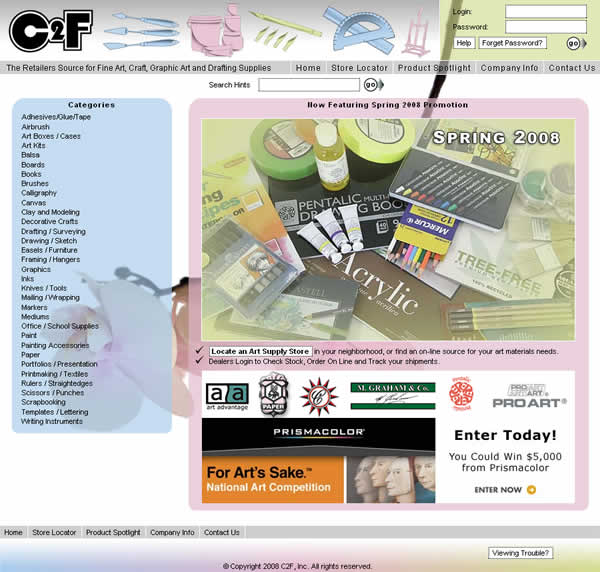
C2F Spring 2008 Web Site Theme
Oops, I forgot to post on the new web site theme again. Well, here it is, a few days late. I reused much of the same functionality of transparent PNGs that I researched last season. I'll likely reuse this whole transparent idea for the next several times. I also decided to go for an intentionally more graphically lean design. While I like the bold look of the Winter design, I felt the need to go back to basics. Another conscious decision related to simplicity was to take a photo of a group of products for the home page rather than collaging together individual product photos already taken. It's more laborious since it involves pulling the product and arranging, etc., but I think the effect is worthwhile.
Previous Posts About C2F Themes:
- 1.15.2008: C2F Winter 2007 Web Theme
- 9.7.2007: C2F Holiday 2007 Web Theme
- 5.1.2007: C2F Back to School 2007 Web Theme
- 3.1.2007: C2F Web Site Spring 2007 Theme
- 12.19.2006: C2F Web Site Winter 2006 Theme
- 8.19.2006: C2F Website Holiday 2006 Theme
- 7.12.2006: New C2F Site Release
- 4.19.2006: New C2F Site Coming Along
- 2.27.2006: C2F Schools II - A CSS Layout
- 1.27.2006: C2F Schools
