The Dark Side, and the Light
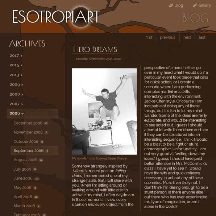
Since I last wrote there have been a bunch of changes to the scripts and some minor style changes. The script changes are mostly invisible changes, building up to the addition of future features. The style changes have been minor until tonight, when they become quite a bit more noticeable. Suddenly I was bothered by the stark contrast between the bright white content blocks and the dark brown background. Not only that, but when browsing late at night it's just too bright!
A few weeks ago I considered the idea of light and dark themes represented by a sun  and moon
  toggling icon that would switch between day and night themes when clicked. Like this or this. Maybe someday I'll add that dynamic CSS feature, but today's solution is to completely switch from light to dark offering zero choice. Isn't it weird how quickly some things can get "old"? Now that I have just finished switching to a dark theme, a part of me likes the light theme better. Ha! Eh, who cares. I'll keep it dark for now... until I can't stand it anymore. Then maybe I'll go with cycling rainbow colors.
The dark theme fits better with Esotropiart's historical look, so that also justifies today's change. Esotropiart has a lot to do with looking back through life's old thoughts and happenings (all blogs that survive more than a couple years could say the same). I didn't want this year's relaunch to be such a drastic change that nothing visually recognizable remained of Esotropiart. The two primary vestiges that remain (besides ancient content) are the color brown and the general look and feel of the logo.
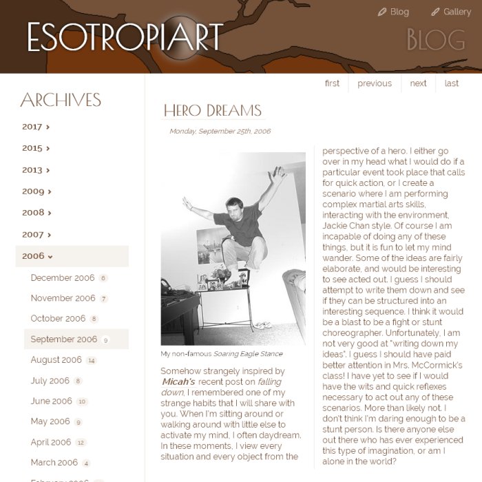
The original Esotropiart logo font was Lithograph from an old Corel font collection. The Adobe font equivalent is Lithos. My hope was to continue using Lithography. Unfortunately most fonts come with restrictive licenses that disallow distribution of the source files over the internet. Therefore, I can't convert a licensed font into a web font. A long search through several free web font collections turned up Poiret One from Google Fonts which is pretty similar to Lithography.
The circle, orb or "moon" behind the "A" for Art was also transferred over from the original logo. Better yet, it is animated for the first time! If memory serves, this is my first CSS animation. The last time I was keeping up with the industry standards and cutting edge CSS techniques, animation was just an initial conversation, maybe not even a W3C recommendation yet! Certainly zero browsers were attempting to support such things at the time. Nowadays CSS animation has pretty universal support in all modern web browsers. Yay!
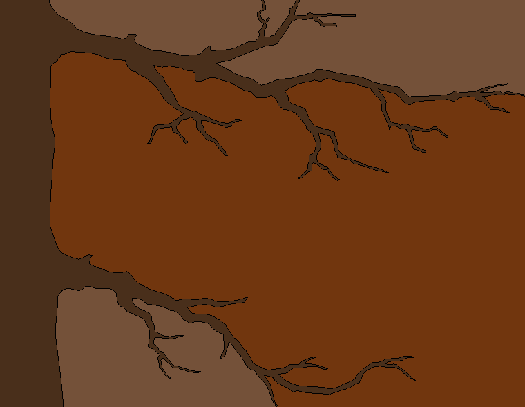
The current page background is another residue from the original site. I believe it was the very first background image from Esotropiart's beginning in 2001! I didn't even bother to create a higher resolution image for this redesign. It's literally the same GIF file I used 16 years ago. The pixelated, retro look is kinda fun for now. Nevertheless, I do plan to recreate the tree branches graphic. It will be higher resolution, but I'll remain faithful to the original color scheme. Perhaps I'll see if an SVG will work (there are two embedded in this post, can you spot them?). Depending on the complexity of the paths, a fairly hires PNG might still be smaller. I'm waiting for late fall when the trees are leafless for good branch silhouette references. I refuse to cheat by using an image from the web as inspiration. It's a good excuse to get outside and view some scenery. The new image will also tile vertically so it can be used on any size of screen.