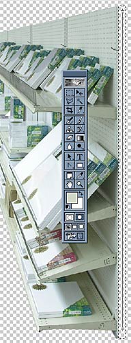
I don't know if you noticed from such a small picture, but none of those vertical surfaces that the shelves were hanging on in Slide 9 had thickness! Can those heavy shelves really be supported by paper-thin pegboard? I think not. They need thickness.
In order to create the illusion of thickness, I made a filled rectangle next to the end of the shelves to work as an endcap. I created an empty layer and selected a rectangle to work with using the rectangle selection tool. I set up a 2-color to fill the selection. The top color was sampled from the bottom shelf (using the Eyedropper Tool), and the second color was a slightly darker variation of the first color. With the gradient tool, I clicked and dragged a gradient inside the rectangle selection from top to bottom. The gradient fills the rectangle and nothing outside, cuz that's what masks do!
To add a little extra illusion of depth to the metal end plate, I applied a subtle bevel filter to the new object, which essentially makes an object look like a button by giving it a 3D border.
Important Sidenote: Always, always, always create new layers when creating new material. If I didn't create a new object or layer before filling the rectangle end plate with a gradient, the gradient would have simply overlapped/merged into whatever layer was previously selected. Once you overwrite imagery on the same layer, it cannot be manipulated. Each and every element should be a separate object, so create a new layer before making anything new. In my final file, there are over a hundred floating layers. Yes, it can get confusing what is what (and what should be behind what), so naming each layer something other than "Layer 27" is helpful (though I'm usually too lazy to do so). To figure out which layer is which, select a layer in the Layers panel (say "Layer 4"), and hide it by clicking on the adjacent eye icon. See what disappears in your image, and you know which layer that one is. Name it something meaningful (like "Shelf 1 Endcap") and continue.