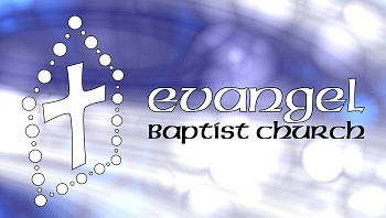
Evangel Logo

A few weeks ago I was approached by a friend at church. He informed me that he was working on getting our pastor's sermons online via iTunes. He requested that I make some sort of graphic to display along with the sound files. So my task essentially became to make a logo for the church, more-or-less. Well, at least that's how I decided to approach it.
So more for fun than anything else, I set out to think of a logo concept that would somehow capture at least some of the important unique characteristics of our church body.
Our greatest strength as a local church body is our people. Now, that may sound silly, but it really means something. We are a small body; under 100 attend most Sundays. But within that small group, there is a lot happening. We are like a great, extended family. I think what makes this church unique is this feeling of acceptance over a broad range of personalities. Combined with Pastor's vision to see us grow and walk in a real, vital relationship with Jesus Christ, rather than simply believing truth... it is a great place to be, to grow.
Anyway, I tried to bring the family into the logo by erecting a house shape, composed of spheres. I guess the idea is that we are one body. Our building is not so much important, but the church is made up of the units of the very people themselves, each formed in the image of God, each an important part of the structure. Christ is at the center, and we do our best to draw near to Him and make Him known.
This logo underwent quite a few revisions, and I don't even know if it is even done yet. Besides, this logo was never sanctioned by the church, and it is more for my own amusement. I don't even know if it will be used officially for anything. Here is an album outlining the development and process of creating the logo. As/if I make changes or come up with something better, I'll add more slides.